star Just a heads up!
We're actively looking for feedback!
Menus are currently experimental and are undergoing a phase of user testing. We want to make sure Clone provides a simple, yet accessible and user-friendly solution to how menus are handled. It is likely that menus will change in the future, so please use them at your own discretion. All changes made to menus will be noted in the changelog over on Github.
Choosing Your Menu
Clone offers two menu layouts that can be used under different circumstances. Both menus automatically respond and collapse to a functional mobile menu on smaller devices.
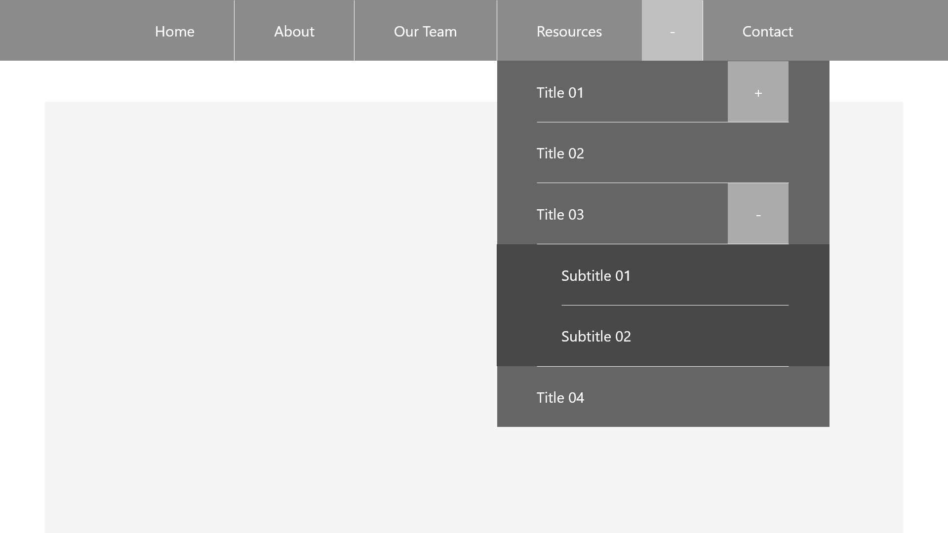
Topbar
Topbar menus are great for sites with minimal content and navigation. Examples include brochure sites, portfolios, etc. These menus require more invasive space to provide access to nested content, so it's recommended to only use them when the information hierarchy is simple. Clone offers static and sticky options for this menu.
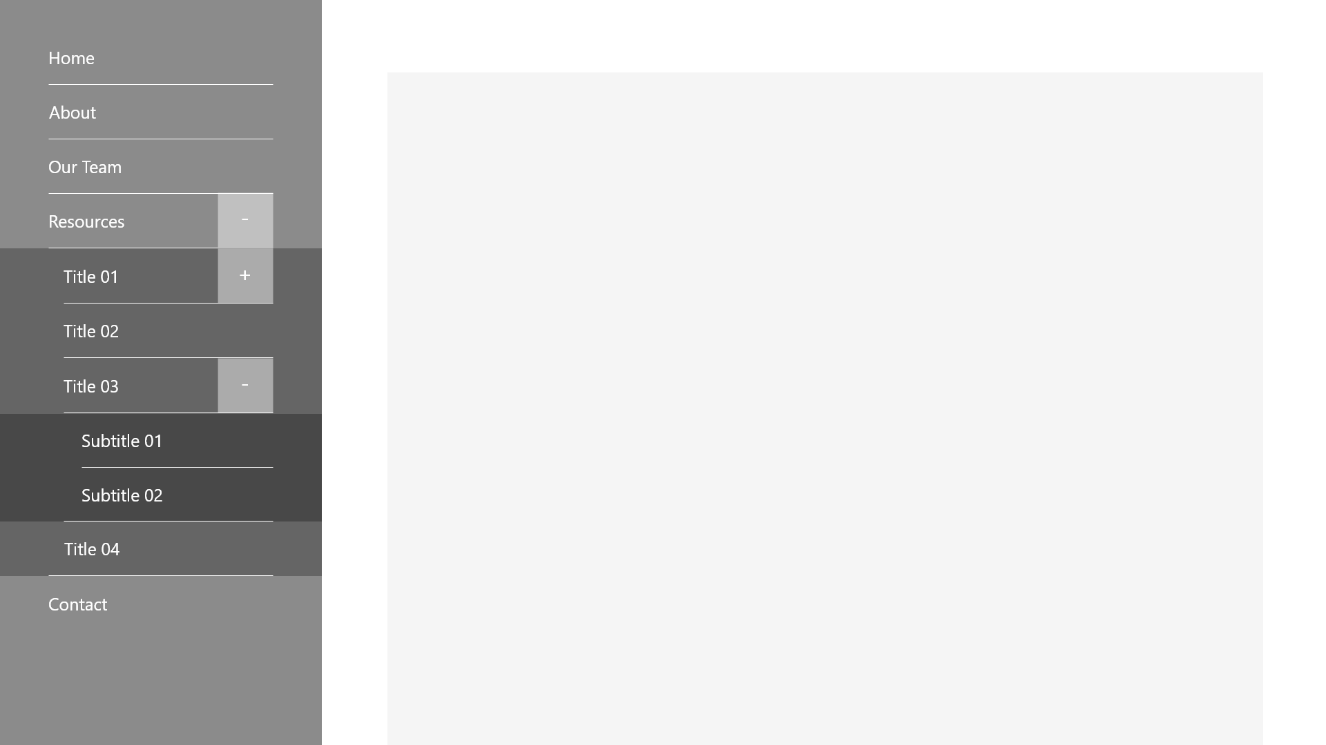
Sidebar
Sidebar menus are great for high density content. They allow the user to navigate large hierarchies of the site without obstructing the precious vertical space needed by the content. Sidebar menus also provide a larger space for branding opportunities and supplementary links or actions the user can commonly take. When a sidebar is implemented, Clone automatically handles containing content within the remaining space. An example of the sidebar menu in action can be seen on your left (or click the "Open Menu" button on mobile!).
Mobile
Clone collapses both topbar and sidebar menus into an offscreen mobile menu. This menu is functionally the same, thus retaining the expected experience on various devices. Tap targets have been deliberately designed to be large enough for touch use.
The menu can be opened and closed at any time using a button located at the bottom of the user's screen. This button can be customized as you see fit, however it is designed to use text over an icon to indicate clarity to the user (over something like a hamburger or kebab icon). By positioning the button at the bottom of the screen, Clone allows for easy access using the thumb while using the device single-handedly.
Accessibility
The mobile menu is designed in a way that automatically focuses the first targetable element in the menu structure, at which point the user can tab through the menu as normal. When they reach the end, they'll be able to tab to the "Close Menu" button, and if they continue past that, their focus will return back to that first targetable element.

Installing Your Menu
Installing your menu of choice requires two main steps, followed by customization as described in the following section.
To begin, we need to give the <body> tag a unique data-c-menu-style attribute to determine the menu's type:
<!--Topbar Menus-->
<body data-clone data-c-menu-style="topbar">

<!--Sidebar Menus-->
<body data-clone data-c-menu-style="sidebar">
Once this is done, you can move forward by installing the menu proper inside your <body> element using the following markup:
<!-- This is the button that opens the menu on mobile devices. -->
<button  type="button" data-c-button="solid(c5)" data-c-menu-mobile-trigger role="button" aria-label="This button opens the main navigation menu." aria-pressed="false">
    <span>Open</span><span>Close</span> Menu
</button>

<!-- This is the menu proper. Note the data-c-menu property. -->
<nav data-c-menu>
    <ul>
        <li><a href="" title="">Menu Item 01</a></li>
        <li><a href="" title="">Menu Item 02</a></li>
        <li><a href="" title="">Menu Item 03</a></li>
        <li><a href="" title="">Menu Item 04</a></li>
        <!-- This item provides an example of how a submenu works. Items with submenus require the button element. Submenus can be nested up to a hard cap of 5 layers. -->
        <li>
            <!-- The parent menu item. -->
            <a href="" title="">Menu Item 05</a>
            <!-- The submenu trigger. Note the data-c-add/remove properties. -->
            <button data-c-menu-submenu-trigger>
                <i data-c-menu-add class="material-icons">add</i>
                <i data-c-menu-remove class="material-icons">remove</i>
            </button>
            <!-- The submenu. -->
            <ul>
                <li><a href="" title="">Submenu Item 01</a></li>
                <li><a href="" title="">Submenu Item 02</a></li>
            </ul>
        </li>
        <li><a href="" title="">Menu Item 06</a></li>
    </ul>
</nav>
Customizing Your Menu
Basic Properties
The data-c-menu-style property can be customized using a few values to modify some basic properties. These properties depend on the type of menu you're implementing:
Topbar Menus
By default, topbar menus are set to the static, and left aligned values. This means the topbar does not follow the user down the page, and the menu items are left aligned. Properties can be combined by comma separating them.
<!-- Static, Sticky -->
data-c-menu-style="topbar(static)"<!-- This topbar will stay at the top of the page. -->
data-c-menu-style="topbar(sticky)" <!-- This topbar will follow the user down the page. -->

<!-- Left, Centre/Center, Right -->
data-c-menu-style="topbar(left)" <!-- The menu's items will align to the left. -->
data-c-menu-style="topbar(centre)" <!-- The menu's items will will be centre aligned. -->
data-c-menu-style="topbar(center)" <!-- The menu's items will will be centre aligned. -->
data-c-menu-style="topbar(right)" <!-- The menu's items will align to the right. -->
The menu element itself can be combined with the container attribute to align the menu with the rest of your site content. This can be done by adding the container attribute to the menu element. These styles actually target the nest list item to ensure that your background colour stretches across the whole screen, while the menu's contents are contained as expected.
<!-- No Container -->
data-c-menu

<!-- Containers -->
data-c-menu data-c-container="small"
data-c-menu data-c-container="medium"
data-c-menu data-c-container="large"
Sidebar Menus
By default, sidebar menus will appear on the left side of your application, and automatically confine your content within the remaining space on the right.
<!-- Left, Right -->
data-c-menu-style="sidebar(left)" <!-- The sidebar will appear on the left, with the website content on the right. -->
data-c-menu-style="sidebar(right)" <!-- The sidebar will appear on the right, with the website content on the left. -->
Custom Colours
Clone allows you to control certain colour aspects of the menu and its submenus. Use the variables below to customize the menu to match your theme.
// Menu Colour Options
$clone-menu-background-colour: black; // Main menu background.
$clone-submenu-background-colour: orange; // Submenu background colour - this colour automatically gets darker the deeper you go into a submenu.
$clone-menu-font-colour: white; // The main menu's font colour - submenu font colour is handled programatically based on the background colour you've selected.
$clone-menu-divider-colour: rgba(orange, .5); //  The colour of the dividers in the main menu - dividers in submenus are programatically handled.
$clone-menu-icon-colour: white; //  The colour of the icons in the main menu - icons in submenus are programatically handled.
Changelog
Version 2.4.14
- Fixed a bug where padding on mobile menus remained when they transitioned to desktop menus.
Version 2.4.11
- Fixed an issue where menu buttons were overlapping with dividers.
- Fixed an issue where the menu had no padding on its bottom, which caused the mobile button to overlap with the menu items in the list.
Version 2.4.7
- Fixes a bug where the body element would be locked if the mobile menu was opened and then the screen was resized to desktop.
Version 2.4.5
- Fixes line height of buttons in menus.
- Adds support for containers on menus (the
data-c-containerattribute can be used ondata-c-menuelements and will style the nestedulaccordingly). - Assigns a minimum width of
25remto submenus on topbar style menus.
Version 2.3.15
- Removes code that focuses the first element on the menu when it opens on mobile devices in favour of keeping the open/close button focused.
Version 2.3.14
- Fixes a bug where the menu locks the body overflow on mobile devices.
Version 2.3.10
- Adds customizable, responsive menus to Clone
- Menus can be topbars or sidebars, and support up to 5 nested submenus in the
ulstructure. - New variables have been added to facilitate cutomizing the menu.
- Menus can be topbars or sidebars, and support up to 5 nested submenus in the